This article is a summary of the publication Seeing is Believing : A Guide to Visual Storytelling Best Practices by Resource Media
300 million photos are uploaded on Facebook alone every day in 2017 (source), that’s how powerful our drive for pictures is. No story has the power to move people without visual support. This is why we all need to understand the principles of visual communication.
First Principle: we are a visual species.
Study after study bears this out. Effectively pairing words with pictures and video enhances attention, memory, recall, and believability. For example, in one study when information was presented orally, people remembered only about 10 percent of what they heard when tested 72 hours later. That figure jumped to 65 percent when pictures were added.
Second Principle: Our decisions and actions are based more on emotional reactions than rational thought.
Good visuals make people feel first, and think second. Effective pictures and videos evoke powerful emotions. Emotions drive decisions. Let emotions be the initial filter for selecting one picture over another.
Third Principle: Visuals are the most effective communications vehicles for evoking emotion and getting people to take action.
The rationale for paying close attention to visuals when you are trying to get people to make a decision or change behavior is clear. However, understanding that pictures are important isn’t enough. You need to be intentional about how you use them. This is where the art of communications strategy meets the science of human behavior.
7 rules for effective visual communication
1. Don’t assume others will react to a picture or video the same way you do. Test visuals with your target audience.
A few hundred dollars is sufficient to run several versions of your campaign concurrently on Facebook to see which headline and photo combinations generate the most clicks. As the digital landscape evolves, traditional opinion research firms and online companies are developing new, creative, inexpensive ways to test how various images perform before finalizing the design of campaigns.
2. Pair your pictures with words for highest impact and to cement them deeper into your audience’s memory.
If your pictures are going out via social media, consider integrating captions into the pictures so that they can travel together throughout the social web. These social memes can go viral precisely because the message – humorous or serious – is not lost when the picture gets shared over and over again.
3. Make sure your images match your message.
If your visuals send one message and your words send another you create a disconnect in your audience’s mind. Don’t, for example, pair a devastating picture with a hopeful headline. The visuals will win the battle against words every time.
In this campaign, for example, in spite of the fact that the written messages detail how bad smoking is, the social cues in the image drive people in the exact opposite direction:
4. Use genuine, not generic pictures.
One good test to determine whether a photo has true emotional impact or is simply filler is to try and write a caption or cutline for it. If you can’t write a caption for the photo that relates to the point of the body copy surrounding it, the chances are good your photo does not belong there.
5. First impressions matter! Invest the most in the first picture your audience sees
Think of the first picture your audience might see in any communication you develop as the “hook.” But make sure you are hooking the emotion you want. Don’t confuse the most beautiful photo with the most effective photo. The two can be very different.
6. To use pictures effectively, be diligent about taking them…
The most effective photos will, of course, reflect the work you do on the front lines. You can also get great photos from your supporters or you can mine the Internet for photos. If you are looking for free, legal-to-use photos on the Internet, the Creative Commons is the place to go.
7. People relate to people in pictures. Choose your subjects carefully.
Common ground between your cause and your audience can quickly be established through pictures of people. But choose those people pics with an eye to what works best. For example, we are biologically programmed not to look away from people looking straight at us.
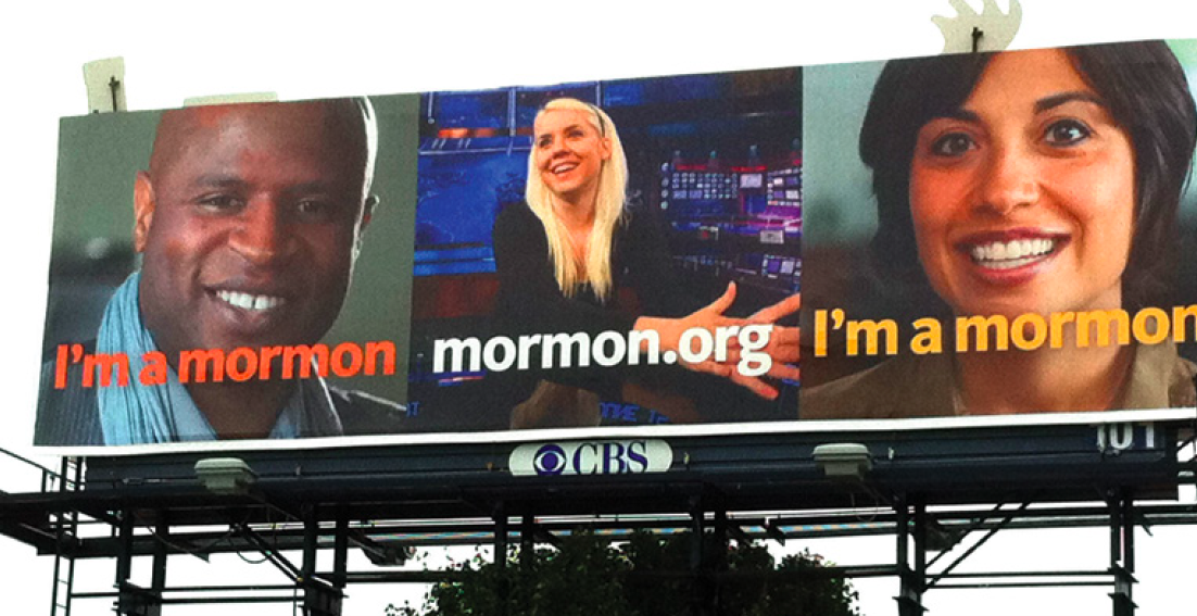
We also connect better with people who are most like us. The 2012 “I’m a Mormon” campaign used this principle when showing people of many different ages, occupations and ethnic backgrounds above the simple caption “I’m a Mormon.” The campaign was meant to make the Mormon Church seem more accessible, more mainstream, by getting people to recognize themselves in at least one of these pictures.
Babies provoke an especially powerful emotional response. One experiment conducted in the streets of Edinburgh, Scotland in 2009 reveals our altruism when it comes to babies. The researchers planted 240 “lost wallets” all over the city and found that the ones that had photos of babies in them were returned a whopping 88 percent of the time. Compare this to the wallets containing photos of elderly couples, which were only returned 28 percent of the time, and those with no photos in them were returned only 14 percent of the time.
Last but not least, favour single people pics : When it comes to photos, our eyes want to focus in on one thing. Our brain hates the effort involved in processing a group shot. Effective fundraisers know that showing a single individual who represents. Group photos are effective when it comes to protests, rallies or public meetings on an issue. These are good times to show pictures of masses of people as your main point to the viewer is to show how many people cared enough to turn out, not for the viewer to care about an individual person.


