Insight Ukraine is one of the country’s leading LGBTI groups.
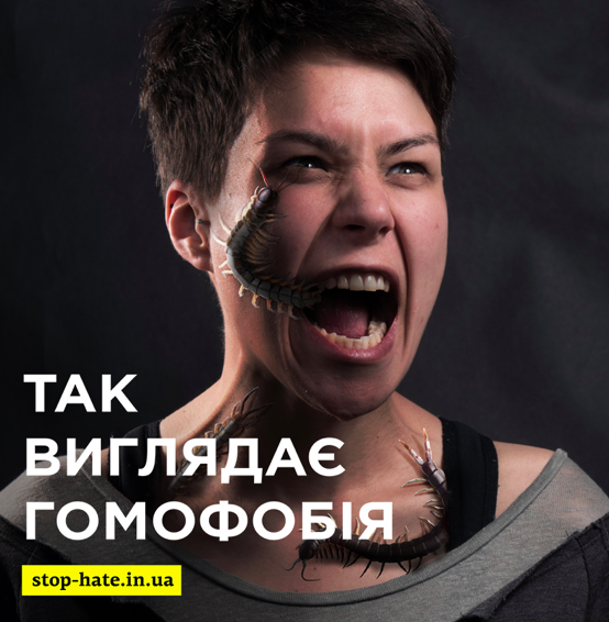
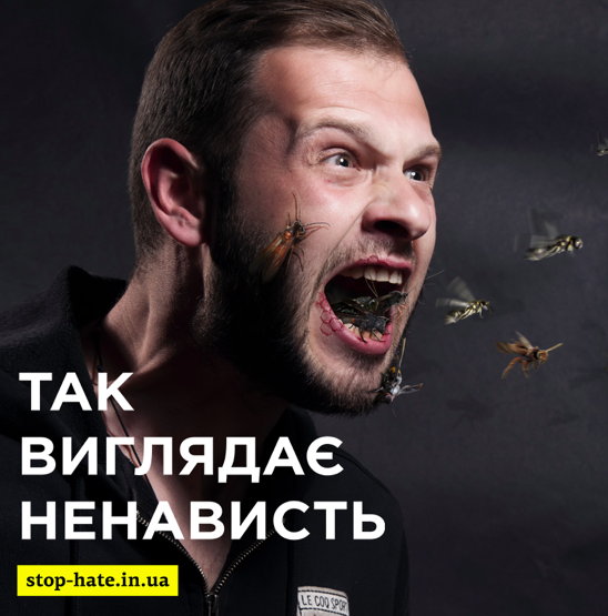
In 2017, they developed the quite unforgettable “Words Hurt” campaign. Just one look at the posters and you will get what we mean.

Information manager Taya Gerasimova shares some precious reflections with us on this campaign.
Was this Insight’s first attempt at campaigning?
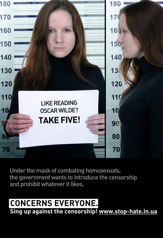
We had already engaged in a campaign in 2012 against the attempt of our Government to pass a so-called “propaganda” law. We used a provocative approach that exposed the deeply flawed logic of this law by signaling that anybody reading an Oscar Wilde book or watching a Pedro Almodovar movie risked five years in prison for that.

So, provocation is not totally new, but we definitely took it up a notch or two here.
How did this campaign start?
We weren’t facing a particular challenge, like a law or a scandal, so we had the necessary space to develop a “proactive” campaign, where we could be in control of the message. A friend of mine works in an advertisement agency and offered to develop something pro-bono. This seemed all the more of a good idea as this person is a young straight progressive person, exactly the kind of target we wanted to reach.
And so he was both developing and testing the campaign?
Yes, and he also tested the visuals and the messages on friends and colleagues, so we had a good sample to get feedback from. There wasn’t a deeper testing process, like focus group discussions, for lack of budget, but this was definitely better than nothing.
What was the general idea?
We knew that we could only get limited attention from the target group if we only spoke about LGBTI issues, so we decided to expand the message and include racism and abuse of women. While there was a challenge to have such a “big tent” approach, it helped in getting the attention of progressives who are convinced that racism and violence against women are wrong, but whose attitudes towards LGBTI people are more nuanced. So we tried to activate the “association bias” by pairing our concerns for LGBTI people with other concerns.
We also wanted to tackle the root causes of stigma and discrimination, and an intersectional approach was key to doing this.
How did the campaign unfold?
The campaign had two phases: first, we issued some posters with the kind of hate speech that we hear every day about women, LGBTI people, and ethnic minorities.
The second phase was the issuing of the “insect” posters, which were aimed at shocking people so much that they would go online and find out what the campaign was about.

As our target group was essential young people, we relied a lot on Update, a youth-focused website that speaks of the concerns of young people, like sexuality, drugs, confrontation with the police, etc., in their language. The site has up to 100,000 visitors per month, so we are really reaching out widely to Ukrainian youth. We also disseminated the visuals via our networks of journalists and creative people in advertising. With these folks, we were confident that it would go viral quickly, which it did.
We also of course received a lot of interest and support from other groups working on women’s rights or for ethnic minorities.
The campaign was seen by 20,000 users of the website and increased our Facebook subscribers by 1,500. About 10,000 people read one of the articles of the campaign “9 jokes that are not fun” on update.com.ua
The most unusual part of the dissemination strategy is that we chose to also go off-line and use billboards. While this cost quite a bit, we felt is would be essential in order to raise public awareness beyond our “obvious” young target.
The main striking feature of this campaign is the violence of the visuals. How was this perceived?
Of course some people didn’t like it, but luckily enough our organisation knows how things work and trusted the professional team which developed the campaign.
By and large, we achieved our aim, which was to catch people’s attention. One good indicator of that is that far-right groups diverted our posters to create anti-LGBTI hate speech. The kind of recognition we could do without, really…
What lessons did you learn from this campaign that you would like to share with other campaigners?
It’s good to have the help of professionals who are not from the community. This way, there is at least some form of testing of both visuals and texts with the target group.
Some testing is better than no testing. In our case, the developer’s social environment was a useful testing ground.
An intersectional approach is key to unwrapping the root causes of stigma. While it may seem like it is “diluting” the attention, it actually serves more to increase the attention to LGBTI concerns from people who we would probably not reach if we had an “LGBTI-only” approach.
Shocking and provoking are good to attract attention. But they also have their limitations. In our case, we couldn’t get the posters to be displayed in the metro because they were deemed too extreme. There might also have been people who didn’t share them on social media for this reason. But by and large the attention the campaign got far exceeded the resistance. Maybe in future we’ll try a somewhat more neutral approach. Let’s see.


